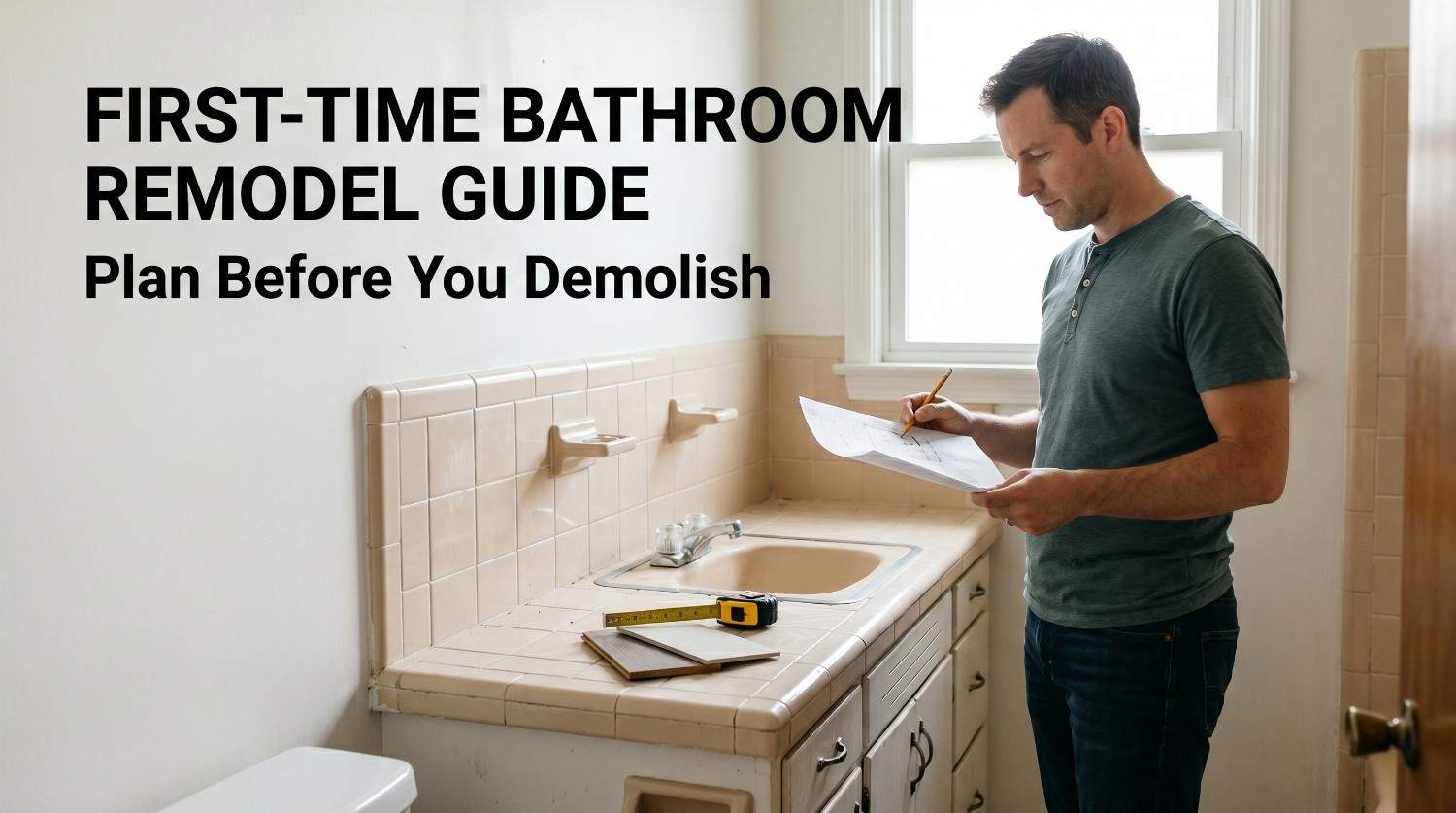
Colour drenching has had its moment. You painted the walls, the ceiling, the trim all in the same deep sage or oxblood and the room became something else entirely. Tile drenching takes exactly that logic and runs it through a bathroom.
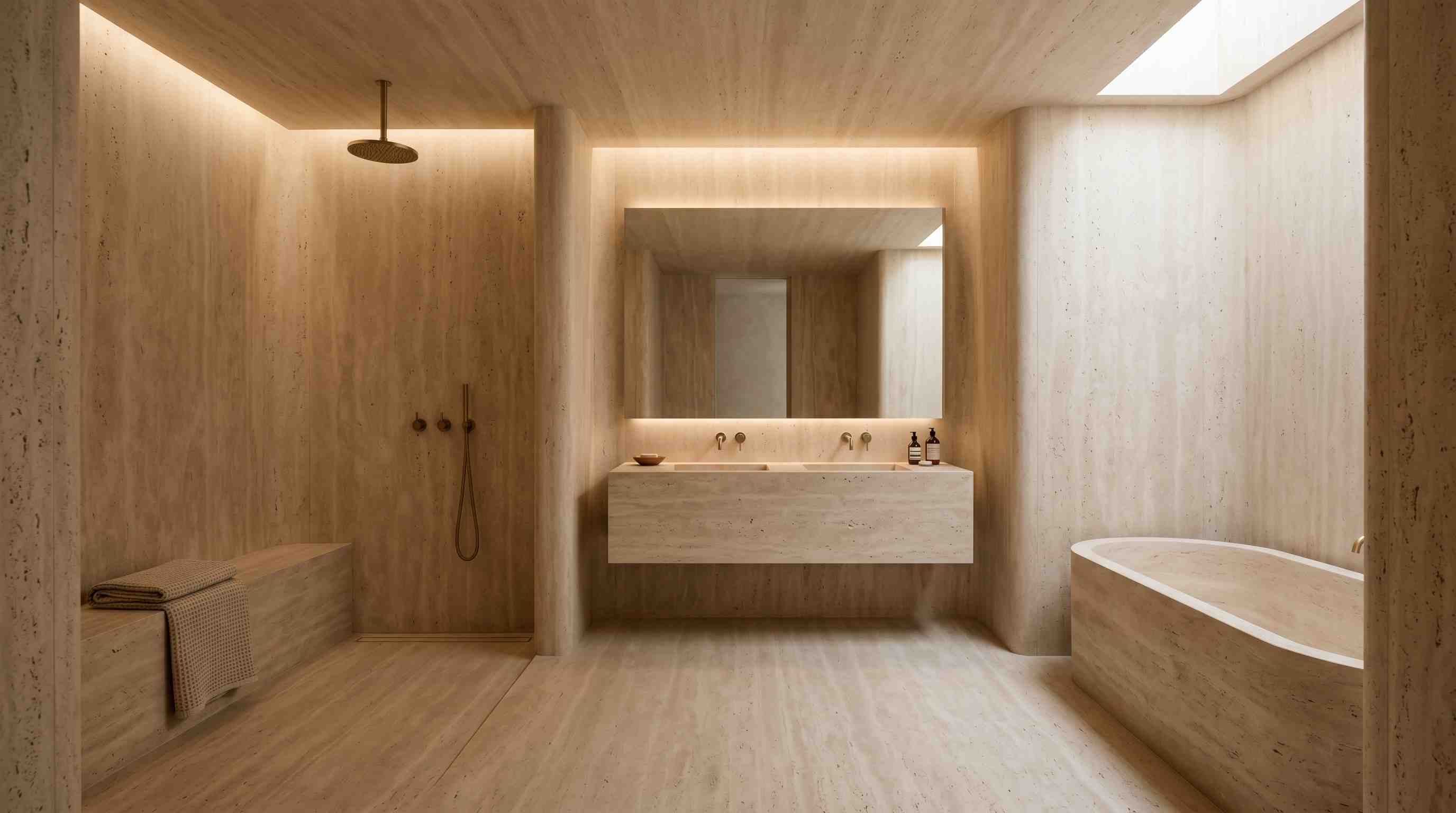
The idea is simple in principle: the same tile or the same tonal colour family is used continuously across the floor, the walls, and sometimes the ceiling, with no interruption, no transition material, no change of direction. The result is a bathroom that doesn't look like it has been tiled. It looks like it has been carved from a single material.
Tile drenching using the same shade tile on the floors and the walls if done correctly can create an eclectic immersive experience. What makes it more than a passing Instagram aesthetic is this: tile drenching requires more conviction than colour drenching.
Why Tile Drenching Works Better Than Paint in a Bathroom
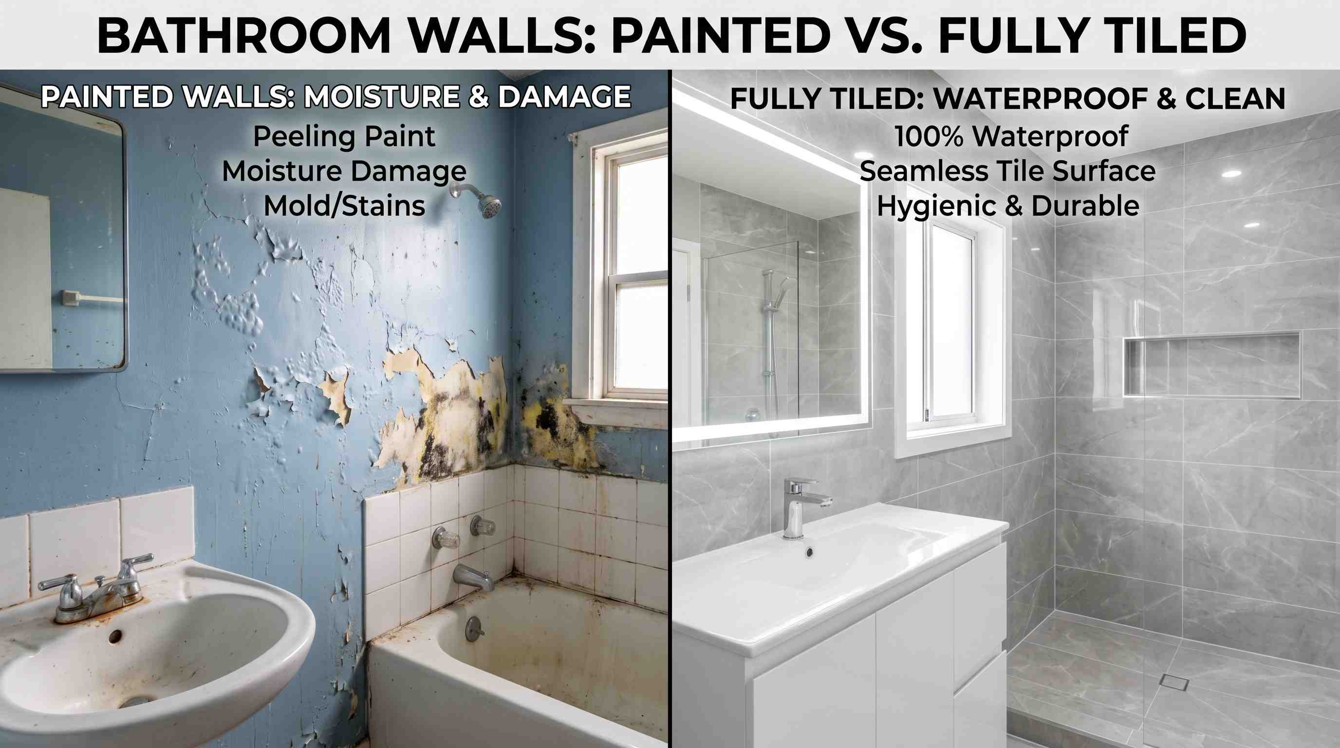
Paint drenching creates an atmosphere. Tile drenching creates atmosphere and does something paint cannot: it treats the entire bathroom as a waterproof, steam-resistant, wipeable surface.
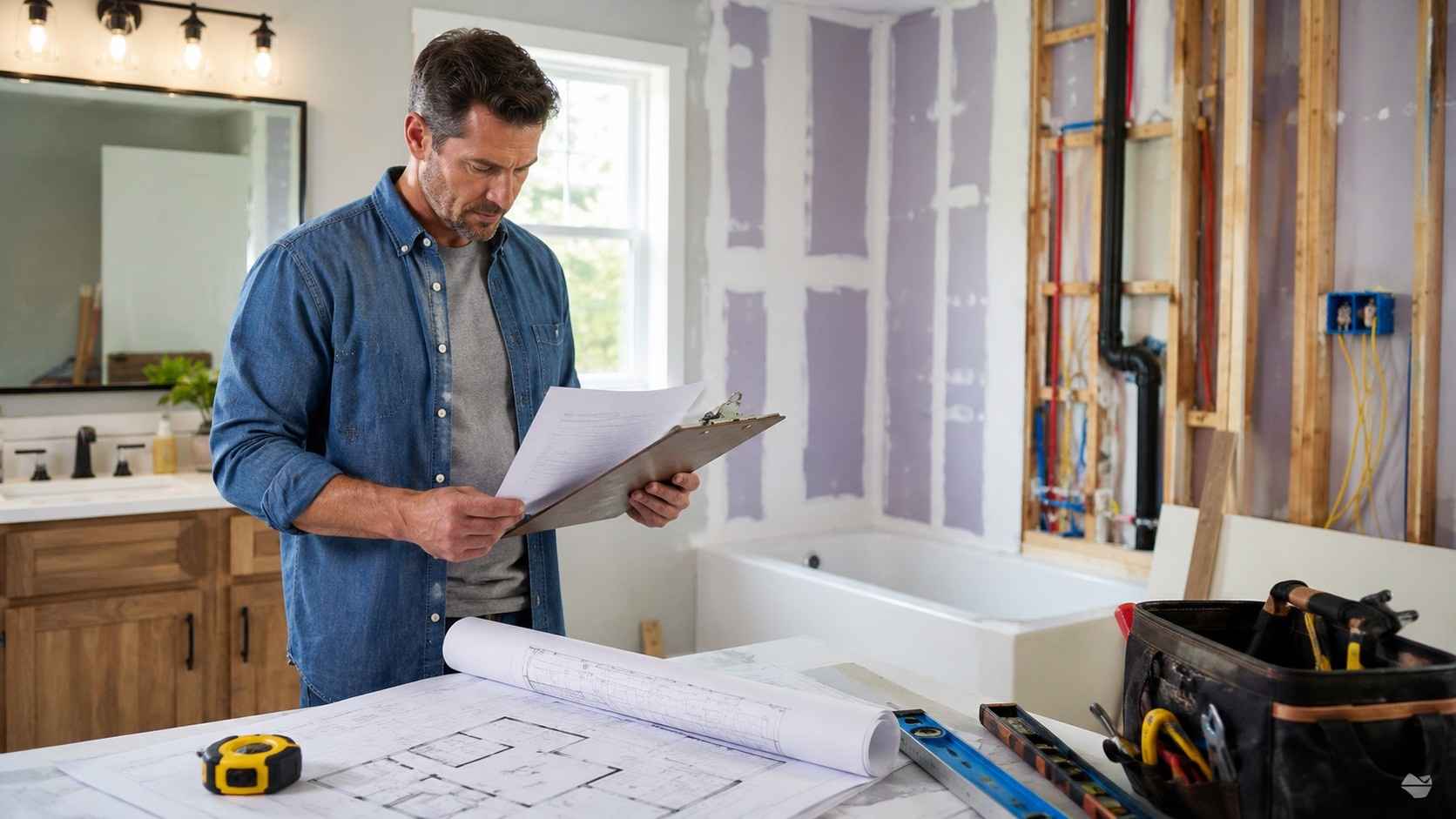
Painted drywall in a bathroom is always a compromise. It yellows, it peels at seams, and in high-humidity zones around the shower, behind the basin, above the bath it is the first thing to fail. Tile removes that compromise entirely. When you drench a bathroom in tile, every surface that ever faced moisture damage now faces it with the correct material.
Caroline Kopp of Caroline Kopp Interior Design makes this case plainly: limiting tile to floors and walls was often done to save money, but a bathroom can always benefit from more tile, not less, for waterproofing reasons.
Where Tile Drenching Works Best
Small Bathrooms
The most counter-intuitive truth about tile drenching is that it performs best in small spaces. The instinct when dealing with a compact bathroom is to fight for lightness, pale walls, contrast, anything that breaks the room up and suggests more space. Tile drenching reverses this.
Removing the contrast between floor and wall removes the visual horizon. The eye moves uninterrupted from the floor up the wall and has nothing to stop against. The tile draws the eye upward, creating the illusion of height while making the space feel more intentional and visually cohesive.
Awkward Rooms
Tile drenching is also the strongest design tool available for architecturally irregular bathrooms sloped ceilings, dormer angles, low eaves, rooms that change height mid-space. Erin Williamson of Erin Williamson Design identifies this directly: when there is no contrast between materials, the edges and contours of the room blur. Instead of the eye catching on the awkward angles, it moves past them. The architectural problem dissolves into the material.
Wet Rooms
The wet room is the most natural home for tile drenching. A wet room already requires full waterproofing from floor to ceiling the practical case for continuous tiling is built into the architecture of the space. Adding tile drenching to a wet room is not an upgrade; it is simply doing what the room already needs, but doing it beautifully.
Using the same tile throughout a wet room also eliminates the visual fragmentation that happens when wall tile and floor tile are different materials. The shower zone, the bathing area, and the surrounding surfaces read as a single designed object rather than several tiled sections placed next to each other.
Powder Room
The powder room offers tile drenching without any of the constraints that larger bathrooms impose. There is no shower requiring slip-resistant floor tile. There is no bath surrounded with its own specification. The powder room is a small, low-traffic, high-visibility space where design commitment is the entire point.
Bold palette choices deep garnet, midnight black, full emerald that would feel overwhelming in a primary bathroom work perfectly in a powder room precisely because the exposure is brief and the impact is the goal. Also check about spa bathrooms.
The Grout Colour Rule
This is the decision that determines whether tile drenching works or doesn't and it is almost never discussed as a standalone rule.
Matched grout makes the drench
When the grout colour sits within one or two shades of the tile, the individual tiles disappear into the surface. The eye reads the bathroom as a continuous material, not as a grid of tiles with a pattern between them. This is what creates the seamless, immersive effect that tile drenching promises.
Contrasting grout breaks the drench
A dark grout on a light tile or vice versa defines every individual tile clearly. It creates patterns rather than surfaces. This is not wrong in itself, but it is a different design choice. A bathroom with contrasting grout on every surface reads as heavily patterned, not drenched.If you want tile drenching, match the grout. Order the grout at the same time as the tile and confirm the colour match before anything is laid.
Practical note: matched grout also means that grout haze the residue left on tiles during installation is harder to see and harder to spot if it hasn't been properly cleaned off. This is one reason tile drenching benefits from a professional tiler with experience of the technique, not just general tiling experience.
The Lay Direction Technique
One of the most effective ways to add depth and texture to a tile-drenched bathroom without breaking the colour continuity is to change the laying direction between surfaces, not the tile.
Use the same tile in a herringbone pattern on the floor. Run the same tile in a vertical stack on the walls. The colour is identical throughout, but the floor and walls read differently, one dynamic, one calm. The eye reads texture and movement rather than monotony, without the contrast of a second tile introducing visual competition.
Interior designer Molly Woodward-Moor of Stone Superstore describes this approach specifically: using a metro tile in a herringbone pattern on the floor with the same tile in a vertical design on the walls maintains visual interest and avoids monotony without breaking the tile-drenching effect.
This technique is particularly well-suited to elongated or subway-format tiles, where the directional quality of the tile shape makes the laying pattern clearly visible.
How to Get the Tile Choice Right
Choose Matte or Honed Over High-gloss
A matte or honed tile finish distributes light evenly across a surface. High gloss reflects light sharply, and when you cover every surface in the same reflective material, the room can feel hard and clinical rather than immersive. Reserve gloss for accent moments, a single niche, a ceiling.
Favour Tiles with Internal Variation
Zellige, stone-effect porcelain, and textured tiles all have natural variation within each tile in glaze, tone, or surface texture. When used across a large tiled surface, this variation provides the depth and visual interest that a flat single-colour tile cannot. The bathroom never looks printed.
Large Format Tiles Give a Cleaner Drench
Fewer grout lines mean less visual interruption. A 60×60cm or 60×120cm tile on walls and floor creates a surface that feels more continuous than the same colour in a smaller format. If the bathroom is small, large-format tiles do not make it feel smaller; they reduce the visual busyness of many grout lines, which is the actual source of the cramped feeling.
Don't commit the ceiling too fast
Starting with the floor and walls is already tile drenching. The ceiling extension running tile overhead takes the effect to its most immersive level. It works particularly well in arched or barrel-vaulted shower spaces, where the curved architecture benefits from being wrapped continuously. In a standard flat ceiling, tile overhead can feel heavy unless the room has good natural light. Consider it as a second stage, not the starting position.
2026 Colour Directions for Tile Drenching
The shift in 2026 is toward warmth, saturation, and earthiness. The cool, neutral, minimal bathroom that dominated the previous decade is giving way to bathrooms that commit to a colour and inhabit it fully. Tile drenching suits this shift exactly.
Deep Green
from soft sage to forest is the leading tile drenching colour of 2026. It creates a warm cocooning effect, reads as both natural and luxurious, and pairs with brushed brass fixtures without the pairing feeling expected. Use a stone-effect or zellige tile in deep green for a drench that reads as material-led rather than painted.
Garnet and Oxblood
Garnet and oxblood are bolder and increasingly present. These rich, saturated reds work in powder rooms and shower enclosures spaces where their intensity is contained and deliberate. Against warm lighting, garnet zellige or terracotta-toned tile creates a bathroom with an almost firelit quality.
Terracotta and warm clay
Terracotta and warm clay are more approachable earthy, Mediterranean in reference, natural alongside wood and stone. A terracotta tile drench with a warm oak vanity and unlacquered bronze fixtures is one of the most coherent and liveable colour directions available.
Warm neutrals
Cream, stone, warm white remain the safest and most enduring tile drenching palette. When the tile has inherent variation (textured surface, glaze variation), a warm neutral drench never reads as plain. It reads as architectural.
Making the Rest of the Bathroom Work
The single most important supporting decision in a tile-drenched bathroom is fixture restraint. The tile is the statement. Everything else exists to support it, not compete with it.
Keep mirrors simple frameless, or a simple metal-framed option that sits quietly. Choose hardware in a single finish: brushed brass is the most sympathetic 2026 pairing, warm enough to complement earthier tile colours, distinctive enough to provide the only contrast the room needs. Introduce a warm wood vanity if the tile colour is cool the organic material provides visual rest without introducing a second pattern. Keep towels and accessories minimal. A tile-drenched bathroom with a cluttered surface loses the immersive quality entirely.
The Half-Wall Option
For bathrooms where full tile drenching feels like too large a commitment or where the budget doesn't extend to tiling every surface the half-wall approach is a genuine alternative and not a compromise.
Tile the floor and the lower half of the walls in the same tile. Paint or apply limewash above in the same or closely related colour. The visual connection between the tiled lower half and the painted upper half creates a tonal continuity that references tile drenching without replicating it entirely. This approach also suits bathrooms where the upper walls feature architectural detail cornicing, picture rails, or windows that would be disrupted by full-height tiling.
Frequently Asked Questions
What is tile drenching?
Tile drenching is the technique of using the same tile or a closely tonal tile across the floor, walls, and sometimes ceiling of a bathroom. The goal is to eliminate visual transitions between surfaces and create an immersive, seamless space. It evolved from the colour drenching trend (where all surfaces are painted the same colour) but adds physical texture, depth, and waterproofing that paint cannot deliver.
How is tile drenching different from colour drenching?
Both approaches use a single colour or material across all surfaces to create an enveloping effect. The difference is in material and commitment. Paint drenching is reversible and low cost. Tile drenching is permanent, requires professional installation, and covers surfaces in a material that adds texture, light play, and water resistance. It also, as Lindsay Thornton puts it, takes more courage which is precisely what makes the result more striking.
Does tile drenching work in a small bathroom?
It works especially well. Removing the contrast between floor and wall removes the visual horizon, blurring the room's edges and making the space feel more cohesive and often more spacious. Large-format tiles amplify this effect by reducing the number of grout lines per square metre.
What grout colour should I use for tile drenching?
Match the grout to the tile as closely as possible ideally within one or two shades. Contrasting grout defines individual tiles and creates a patterned effect rather than a drenched one. If the drench effect is the goal, the grout must disappear into the surface.
What are the best tile colours for tile drenching in 2026?
Deep green, garnet/oxblood, terracotta, and warm neutrals are the strongest 2026 directions. Each suits a different bathroom scale and palette. Warm neutrals in a textured or zellige tile are the most versatile and longest-lasting choice.